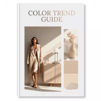
A clear color direction speeds up creative decisions, strengthens brand recognition, and improves campaign consistency across channels. The Color Trend Guide (Digital Download) is built for designers, marketers, and creatives who want a practical way to interpret color shifts, translate them into usable palettes, and apply them confidently to real projects—without guesswork.
Color trends are everywhere, but teams often struggle to turn “inspiration” into a repeatable system. This guide focuses on the real friction points that slow down creative work and dilute consistency:
Instead of treating trend colors like a full palette replacement, the guide emphasizes decision rules: what to use, where to use it, and how to keep it recognizable across channels.
If your team needs faster approvals, fewer “we’ll know it when we see it” cycles, and better cross-channel consistency, a shared color workflow makes a noticeable difference.
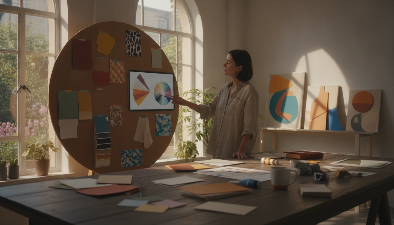
Trend forecasting works best when it’s structured. Instead of collecting colors first, start by identifying the moods and themes your audience is already responding to. Then build a palette hierarchy that supports your brand’s tone and channel needs.
| Stage | Output | What to decide |
|---|---|---|
| Scan & collect | Inspiration set | What industries and channels matter most |
| Theme clustering | 2–4 themes | Which mood matches brand positioning |
| Palette building | Color set | Hero/support/neutral balance |
| Prototyping | Mock visuals | Legibility, contrast, and channel fit |
| Guidelines | Mini style rules | Ratios, pairings, and usage constraints |
Trend palettes are most effective when they’re treated like a controlled layer—not a full reset. The goal is to look current while preserving recognition and usability.
| Channel | Best use for trend colors | Common pitfall to avoid |
|---|---|---|
| Website/UI | Highlights, sections, promos | Low contrast text on colored backgrounds |
| Social content | Template accents, series colors | Too many palette changes week to week |
| Buttons, headers, dividers | Over-saturated backgrounds that reduce readability | |
| Ads | Attention cues, seasonal variants | Breaking brand recognition with full palette swaps |
| Packaging/print | Limited editions, inserts | Unexpected color shift from screen to print |
Beautiful palettes still fail if they reduce clarity. A few quick checks keep trend colors usable across devices and formats:
When you need to explore combinations quickly, tools like Adobe Color can help you test harmonies and variations before you commit them to templates.
Trend colors don’t have to touch everything to be effective. They work best where repetition builds recognition:
For product-driven visuals, color direction can guide styling choices too. Pair a controlled palette with staple silhouettes like the Ankle-Length Sleeveless Casual Dress or Women’s Wide-Leg Pants to keep campaign imagery cohesive across multiple shoots.
If your workflow includes physical production, referencing standardized systems can reduce ambiguity when colors move between teams. For example, Pantone color systems and guides are commonly used for print consistency and vendor communication.
For a streamlined starting point, the Color Trend Guide (Digital Download) supports faster palette decisions and clearer application rules—so “trend” becomes a usable system, not a debate.
Start by building a hierarchy (hero, supporting, neutrals), then assign functional roles like backgrounds, text, highlights, and alerts. Pilot trend colors as accents first (buttons, badges, banners) and expand only after they work across real layouts and templates.
Yes—treat them as seasonal layers rather than replacements. Keep core brand colors stable, and document simple ratios and pairing rules so every channel stays recognizable.
Begin with templates: social post layouts, email modules, and ad variants, since they repeat frequently and create consistency quickly. Then adapt the same roles to web/UI, checking contrast and legibility before scaling.










Leave a comment